{ roi }
Work Impact
7x
Improved business efficiency
45%
Acceleration of new features
33%
Reduced development time
{ DELIVERABLES }
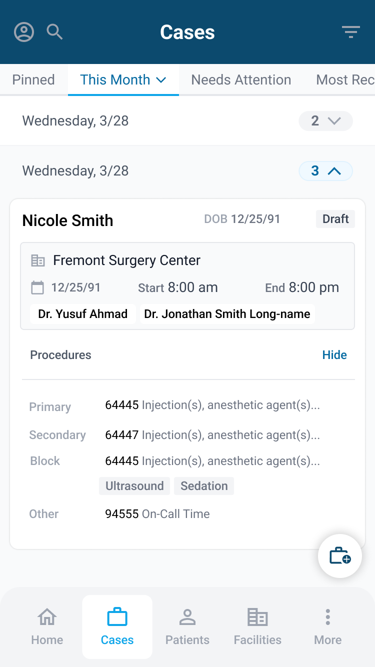
AI-powered React Web App
{ DELIVERABLES }
AI-powered React Web App


{ deliverables }
React Native Mobile App
{ deliverables }
React Native Mobile App


{ deliverables }
Brand Communications
{ deliverables }
Brand Communications


{ DELIVERABLES }
Motion Graphics
{ DELIVERABLES }
Motion Graphics
Supercharging Anesthesia productivity with ai-powered CRM and automated workflows
Supercharging Anesthesia productivity with ai-powered CRM and automated workflows
Clomr is revolutionizing case coordination and revenue management for distributed medical teams. In an industry where unplanned case cancellations and inefficient claim filing can lead to significant revenue losses, Clomr aimed to provide a unified solution that streamlines operations and enhances productivity.
The platform enhances coordination, streamlines communication, and improves efficiency for distributed medical teams, including anesthesiologists, surgeons, sales representatives, and ambulatory surgery centers (ASCs).
As the Head of Product Design, I understood that maintaining consistency and efficiency across our platform required a robust design system. I adopted Atomic Design principles, ensuring that our interface was broken down into manageable, reusable components. This approach allowed us to scale our design efforts without compromising on quality or user experience. Additionally, integrating Material UI provided us with a comprehensive library of pre-built components that we could customize to align with Clomr’s unique branding and accessibility standards.
The goal was to build a solid, accessible design system that could evolve alongside our product, support both web and mobile platforms through React/React Native components, and adhere to WCAG accessibility guidelines. By focusing on design tokens, variables, and auto layouts, I ensured that our design system was not only consistent and scalable but also flexible enough to accommodate future enhancements and user needs.
- Conducting Market and User Research Gaining deep insights into the healthcare industry’s needs and pain points through research and user interviews.
- Design System Development Creating a scalable, accessible design system that supports a cohesive user experience across platforms.
- Collaborative Workshops Facilitating stakeholder workshops to align on product strategy and ensure that the design process was user-centric and business-driven.
Adopting Atomic Design Principles
Adopting Atomic Design Principles
Building a design system from the ground up in a fast-paced startup environment like Clomr requires a strategic approach. I embraced Atomic Design methodology to create a systematic and scalable framework for our user interface.
The Atomic Design approach allowed me to break down the interface into fundamental components — atoms, molecules, and organisms. This hierarchical structure facilitated the creation of reusable elements that could be easily managed and maintained. By focusing on the smallest elements first, I ensured that each component was thoughtfully designed and functionally robust, laying a strong foundation for more complex structures.
Additionally, this methodology promoted consistency across all platforms by standardizing how components interacted and behaved. It enabled our product and engineering team to work collaboratively, leveraging shared components to build cohesive and intuitive user interfaces. This approach not only accelerated the design process but also ensured that our platform remained uniform and reliable as we scaled.
- Atomic Design Framework Broke down the interface into atoms, molecules, and organisms for modularity. Enabled the creation of reusable components, promoting consistency and efficiency. Simplified the development process by providing a clear structure for component organization.
- Reusable Components Developed a library of reusable UI elements to maintain consistency across platforms. Facilitated rapid design iterations and updates without redundant work. Ensured that all components adhered to the same design standards and accessibility guidelines.
- Consistent User Experience Maintained a unified look and feel across different sections of the platform. Reduced the cognitive load for users by providing familiar and predictable interface elements. Enhanced overall usability and satisfaction through cohesive design practices.

Integrating Material UI and React Components
Integrating Material UI and React Components
To streamline our design and development processes, I integrated Material UI with React and React Native components. This integration was pivotal in ensuring that our design system was both efficient and scalable across different platforms.
Material UI provides a robust library of pre-built components to customize Clomr’s unique branding and functional requirements. By leveraging these components, we significantly reduced the time and effort needed to develop new features, allowing our team to focus on innovation and user-centric design enhancements. The customization capabilities of Material UI also ensured that our components remained consistent with our design language while providing the flexibility to adapt to specific use cases.
Furthermore, using React and React Native enabled us to create a shared component library that could be used seamlessly across web and mobile applications. By centralizing our components, we minimized duplication of effort and ensured that any changes made to the design system were instantly reflected across all platforms, enhancing our ability to deliver a unified user experience.
- Material UI Customization Leveraged Material UI’s comprehensive library to accelerate component development.
- Shared Component Library Created a centralized repository of components accessible to both designers and developers.
- Cross-Platform Consistency Maintained uniform functionality and appearance across web and mobile applications and simplified the development process by using a unified technology stack for both platforms.
Utilizing Design Tokens and Variables
Utilizing Design Tokens and Variables
To ensure that our design system was both flexible and maintainable, I implemented design tokens and variables. These foundational elements defined our core design attributes, such as colors, typography, spacing, and other stylistic properties, allowing for easy updates and theming across the entire platform.
Design tokens served as the single source of truth for our design decisions, encapsulating the essential styles that could be referenced throughout our components. By defining these tokens, we eliminated inconsistencies and made it straightforward to implement changes across the board. This approach also facilitated theming, enabling us to quickly adapt our design to different contexts or user preferences without extensive redesign work.
Additionally, we utilized variables to manage dynamic aspects of our design, such as responsive layouts and state-based styles. Coupled with auto layouts, our design system could automatically adjust to various screen sizes and orientations, ensuring a seamless and responsive experience for all users. This strategic use of tokens and variables not only enhanced the scalability of our design system but also significantly improved our ability to maintain a consistent and accessible user interface.
- Foundation Tokens Defined primary, secondary, and accent colors as design tokens for easy theming and standardized typography settings, including font sizes, weights, and styles.
- Layout Variables Standardized spacing units and layout grids to maintain visual harmony, enabling responsive designs and easy adjustments to layout structures without redesigning components.
- Theming and Flexibility Allowed for quick theme changes by modifying design tokens and variables, enhancing flexibility of the design system, making it easier to introduce new styles and adapt to evolving requirements.
Creating a Comprehensive Components Inventory
Creating a Comprehensive Components Inventory
With the design system framework in place, the next step was to develop a detailed inventory of UI components that would form the building blocks of the platform. This inventory was essential for maintaining consistency and efficiency as our product expanded.
I began by cataloging all the UI elements used across the platform, from basic buttons and forms to more complex data tables and interactive modules. Each component was meticulously documented, including its variations, states, and intended use cases. This comprehensive approach ensured that every team member had a clear understanding of the available components and how to apply them effectively.
To facilitate easy access and reuse, I organized the components into a centralized library. This library became the go-to resource for designers and developers, streamlining the design and development process by eliminating the need to recreate common elements from scratch. Additionally, by defining clear guidelines for each component, I reduced the likelihood of inconsistencies and ensured that all elements adhered to our established design principles and accessibility standards.
- Cataloged UI Elements Documented all atoms, molecules, and organisms with usage guidelines, including variations and states for each component to cover different scenarios.
- Defined Interaction States Specified hover, active, disabled, and focus states for interactive components and provided clear visual indicators for different user interactions.
- Centralized Component Library Created a single source of truth for all UI components, accessible to the entire team.
Establishing a Single Source of Truth
Establishing a Single Source of Truth
To ensure that our design system was accessible and usable by the entire team, I established a centralized repository that served as the single source of truth for all design-related assets and guidelines. This repository was crucial for maintaining consistency and enabling seamless collaboration between designers and developers.
Regular updates and maintenance of the repository were essential to keep the design system current and relevant. I implemented version control practices to track changes and ensure that all team members were working with the latest versions of components. This approach minimized discrepancies and facilitated smooth hand-offs between design and development, ultimately enhancing the overall efficiency and effectiveness of our workflow.
- Design System Documentation Created detailed documentation accessible to all team, including guidelines, usage examples, and best practices for each component.
- Collaboration Tools Figma for collaborative design and real-time updates to the design system, enabling seamless communication and coordination between team members.
- Updates & Maintenance Implemented version control to track changes and manage updates efficiently, with periodic reviews to ensure the design system remains aligned with project goals.
Collaboration with Engineering
Collaboration with Engineering
A successful design system relies heavily on effective collaboration between design and engineering teams. Recognizing this, I worked directly with my engineering counterparts to ensure that the design vision was accurately translated into code.
Regular sync meetings were established to discuss design specifications, address technical constraints, and gather feedback from developers. These meetings provided a platform for open dialogue, allowing us to identify potential challenges early and collaboratively develop solutions that aligned with both design and technical requirements.
Additionally, I provided developers with detailed design documentation, including annotations and style guides, to facilitate the accurate implementation of components. By maintaining a continuous feedback loop and fostering a culture of mutual respect and understanding, we ensured that our design system was not only visually consistent but also functionally robust and technically feasible.
- Technical Feasibility Discussions Regular meetings with engineers to align design with technical capabilities and address any constraints or challenges in real-time, ensuring smooth implementation.
- Detailed Design Documentation Provided comprehensive specs, annotations, and style guides to developers, ensuring that all design elements were clearly defined and easy to implement.
- Continuous Feedback Loop Encouraged ongoing feedback from engineers to refine and improve components.
Reflections
Reflections
Implementing a comprehensive design system at Clomr provided invaluable insights and reinforced the importance of strategic design practices in a fast-paced startup environment. The robust design system significantly improved our internal workflows and communication processes, and played a pivotal role in boosting the efficiency of our design and development processes. Adhering to WCAG guidelines was a cornerstone of our design system, ensuring that our platform was accessible to all users.
In this role, I enhanced my leadership skills by effectively managing complex projects and coordinating cross-functional teams. I developed strategies to balance a strategic vision with day-to-day operational demands, fostering a collaborative and growth-oriented environment..
I deepened my expertise in building and implementing comprehensive design systems using Material UI, React, React Native, and improved my understanding of accessibility standards and best practices, ensuring that our designs were both inclusive and compliant.
Furthermore, my strategic thinking was significantly strengthened as I learned to align design initiatives with broader business objectives and user needs. I became adept at identifying and prioritizing high-impact features and components that drove efficiency and user satisfaction.
{ let's.connect }
Book a Meeting
{ let's.connect }
Book a
Meeting
{ © JAVED.IO 2024 }